SAP Power BI Integration: Visualize, Analyze Data Faster
There are a number of ways to visualize SAP data. One approach is to use a tool like SAP Lumira, which allows you to create interactive visualizations. You can also use traditional BI tools like Tableau or QlikView to create static visualizations. Whichever tool you choose, make sure to use colors and shapes that make the data easy to understand.
Does SAP Offer Data Visualizations & Business Insights?
Yes, SAP offers data visualizations and business insights. The SAP Lumira software allows users to create visualizations of data, and the SAP BusinessObjects suite provides a variety of tools for data analysis and reporting. These tools can help businesses gain a better understanding of their data and make more informed decisions.
But…
These are separate SAP suites and all of these cost separately. If you are into finance, you can understand how all of these costs line-up and become substantially high. That’s where connecting SAP reports with Power BI makes sense. Power BI is a powerful visualization tool that anyone can use to extract business insights and get better forecasts.
Why Connect Power BI with SAP?
Here are the top three reasons why you should connect your SAP reports with Power BI visualization tool.
- Data Visualizations
One of the great things about Power BI is the ability to create data visualizations for SAP reports. With just a few clicks, you can create bar graphs, pie charts, and more that can easily reflect your SAP Hana reporting data in a more visual way. You can see your data in a new way and spot trends that you might not have otherwise identified.
- Better Business Insights
As a business professional, you know that having accurate and timely insights is critical to success. With Power BI, you can get more out of your data than ever before. With interactive visualizations and powerful analysis tools, you can quickly uncover trends and patterns in your data. What’s more, Power BI makes it easy to share your insights with others, so you can get everyone on the same page and make better decisions faster.
- Faster SAP Report Forecasting
In order to speed up the forecasting process for SAP reports, you can use the SAP report forecasting algorithm. This algorithm uses past data to predict future values for a given report. The algorithm is based on a regression model, which takes into account the historical trend of the data and the variability of the data.
To use the algorithm, you first need to create a training dataset. This dataset consists of a set of historical data points for the report that you want to forecast. You then need to specify the forecast horizon, or the number of time periods for which you want to predict values. Finally, you need to specify the prediction interval, or the range of values within which you expect the future values to fall.
The SAP report forecasting algorithm can then be used to predict future values for the report based on the training dataset. The predicted values will be within the prediction interval that you specified.
How Power BI Helps Translate SAP Reports into Visualizations?
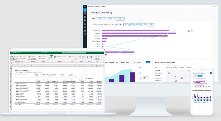
Power BI is a business analytics service that allows users to create visualizations of their SAP data. With Power BI, users can create reports and dashboards that translate SAP data into easy-to-read visuals. This makes it easier for users to understand their SAP data and to make better business decisions.
One of the benefits of using Power BI is that it can connect to a variety of data sources, including SAP. This means that users can combine SAP data with data from other sources, such as Excel files or SQL databases, to create more comprehensive reports.
Additionally, Power BI offers a range of visualization options, including bar charts, pie charts, line graphs, and geographical maps. This allows users to tailor their reports to their specific needs.
Overall, Power BI is an excellent tool for translating SAP data into visualizations. It offers a wide range of visualization options and connects to a variety of data sources, including SAP. This makes it an ideal tool for creating comprehensive reports about SAP data.
Integrate SAP Data with Power BI
Integrating Power BI with SAP can be done either through manual sheet imports or by using a third-party app like Acterys that connects all the databases of the SAP software with Power BI for further visualizations and analysis.
Dashboards for SAP Data Visualization in Power BI
Most simple process for SAP data visualizations in Power BI is with the following process.
1. In Power BI, select Get Data > SAP HANA.
2. In the dialog that appears, enter the name of the server to connect to and your credentials.
3. Click Connect.
4. Select the tables you want to include in your data visualization and click Load.
5. The data will be loaded into Power BI and you can begin creating your visualization.
However, SAP visualizations need to be created with scratch if you go this route. Another better alternative is the use of Acterys for pre-built templates that you can use with SAP for visualizing data.
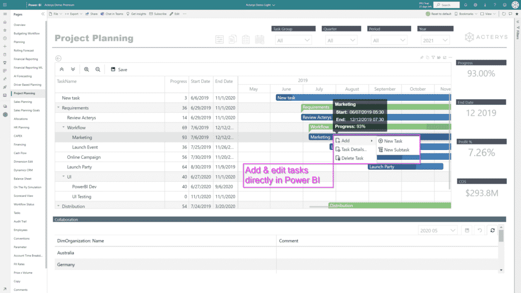
Use Acterys Pre-Built Templates for SAP Data Visualizations in Power BI
Acterys offers a comprehensive data visualization and business intelligence suite for Power BI users. SAP users that want to model & forecast data in Power BI can use Acterys for pre-made dashboards and templates. These pre-formatted templates improve business efficiency and provide users with a hassle-free way to visualize and forecast data in Power BI.
Ready to Get Better Data Insights from Your SAP Reports?
If you are interested in learning more about Acterys Reporting Visuals suite and how it can help your business get improved data insights, then get in touch with us today.